This article was last updated on December 20, 2024, to include advanced styling techniques for Ant Design dynamic forms and integration with form libraries like Formik and React Hook Form. Additionally, the introduction has been updated for clarity.
Introduction
TL;DR: What is Ant Design Dynamic Form? Ant Design provides a dynamic form that enables the developer to create flexible and interactive forms, where users can dynamically add or remove fields if needed, making it quite suitable for complex data collection.
Forms are one of the most adaptable elements in web development. They come in distinct structures for various use cases.
However, due to the sporadic complexity of the information they collect, they tend to grow larger with several fields, which can be a big turnoff for most users.
To solve this user experience issue, developers devised a dynamic form, a simple yet complex form that can grow in size on command.
This guide will teach us how to create a dynamic form using Ant design and Refine's React template.
Steps we'll cover:
- What is a dynamic form?
- What is Refine?
- Project setup
- Building the List page
- Creating a form
- Adding form items
- Adding form list
- Using form actions
- Adding icons
- Validation
- Building the edit page
- FAQ's
- Why Use AntD Dynamic Forms?
Prerequisite
To follow along with this tutorial, you need to have a good understanding of Typescript and the following:
- The latest version of Node.js installed on your machine
- Fundamental knowledge of React and Refine
- Basic understanding of Ant design
What is a dynamic form?
Dynamic forms are complex forms that change their layout according to the data they receive from users. In simpler terms, dynamic forms allow users to add or remove input fields according to their needs.
For example, say you want to create a form that lets users provide optional extended information about themselves, but you don't want to greet every user with a behemoth form. You can create a dynamic form that allows users to add or remove input fields according to their needs.
For context, here's an example of the final CRUD app product of the dynamic form we'll be building in this tutorial:
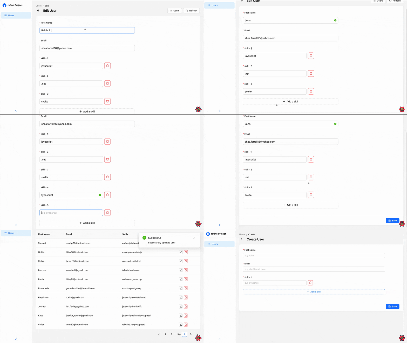
Ant design provides several components that let us build dynamic forms easily and rapidly. We'll learn more about these components later in this article.
What is Refine?
Refine is a headless React-based framework for rapidly building CRUD applications like admin panels, dashboards, and internal tools. The framework uses a collection of helper hooks, components, and data-providers that give you complete control over your application's user interface.
There are a lot of benefits to using Refine in your applications, to name a few:
- Refine is UI agnostic by default; its headless design lets it integrate seamlessly with different UI frameworks and custom designs.
- it has an easy learning curve
- Refine is also backend agnostic by default; it has support for every backend technology.
- Authentication, state management, data fetching, and routing come out of the box.
- Refine is open source, so you don't have to worry about constraints.
One of Refine's core features is its out-of-the-box integration with UI frameworks such as Material UI and Ant design. We'll look at how to use the latter in this guide.
Project setup
Before we go any further, let's set up a Refine sample CRUD app project and install the required packages using superplate.
Superplate is a CLI tool for quickly bootstrapping a Refine project. The tool provides the option of setting up a headless Refine project or a project paired with third-party UI libraries such as Ant design and Material UI. We'll be using the latter for this tutorial.
As a first step, run the following command on your command line tool:
npm create refine-app@latest dynamic-form
The command will prompt you to choose your preferences for the project.
Select the following options to proceed:
✔ Choose a project template · Refine(Vite)
✔ What would you like to name your project?: · dynamic-form
✔ Choose your backend service to connect: · Rest API
✔ Do you want to use a UI Framework?: · Ant Design
✔ Do you want to add example pages?: · no
✔ Do you need any Authentication logic?: · none
✔ Do you need i18n (Internationalization) support?: · no
✔ Choose a package manager: · npm
Once the installation is complete, run the commands below to cd into the project folder and start the development server:
cd dynamic-form
npm run dev
After running the command, the development server will automatically preview our app in the default browser. If it doesn't, open the browser manually and navigate to http://localhost:5173.
To finish setting up, we'll create a UserCreate, UserList, and UserEdit pages and pass them as values to the create, list, and edit properties of the resources prop in the <Refine> component, which you can find inside the App.tsx file.
We'll use the UserList page to display a list of data from a fake API endpoint, to which we'll also post the submitted data from our form.
The UserCreate page is where we'll create our dynamic form for posting new records to the API.
The UserEdit page will house a copy of the dynamic form for editing and updating records.
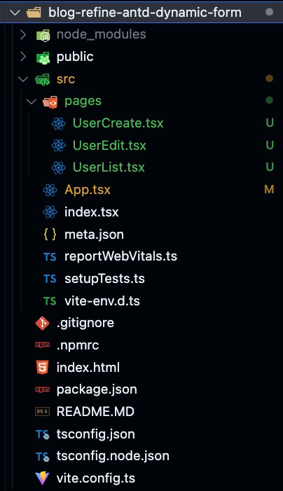
To begin with, create a pages folder inside the src folder and add a UserCreate.tsx, UserList.tsx, and UserEdit.tsx files, as shown below.
To prevent Typescript from throwing an error, you can add a placeholder code in each file like so:
import React from "react";

function UserCreate() {
  return <div>UserCreate</div>;
}

export default UserCreate;
Next, open the App.tsx file and import all three files at the top of the component:
import UserCreate from "./pages/UserCreate";
import UserEdit from "./pages/UserEdit";
import UserList from "./pages/UserList";
Then, set up the <Refine> component by defining the resources prop and assigning the values for create, list, and edit properties.
import { Refine } from "@refinedev/core";

function App() {
  return (
    <Refine
      // ...
      resources={[
        {
          name: "users",
          list: "/users",
          create: "/users/create",
          edit: "/users/edit/:id",
        },
      ]}
    >
      {/* ... */}
    </Refine>
  );
}

export default App;
The resource definitions don't create any CRUD pages. It just defines the resources and the paths for the CRUD pages. The defined resources are used by Refine hooks and components to infer the paths and parameters.
You can think resources are bridge between the dataProvider and routes.
After that, we need to define the routes for each page and resource. To do so, we'll use the <Routes> and <Route> components from the react-router-dom package.
You can find more information about resources and adding routes in the React Router v6.
You can simply copy and paste the code below into the App.tsx file:
import { Refine } from "@refinedev/core";
import { ThemedLayoutV2, ErrorComponent } from "@refinedev/antd";
import routerProvider, {
  NavigateToResource,
  UnsavedChangesNotifier,
  DocumentTitleHandler,
} from "@refinedev/react-router-v6";
import { BrowserRouter, Routes, Route, Outlet } from "react-router-dom";

import UserCreate from "./pages/UserCreate";
import UserEdit from "./pages/UserEdit";
import UserList from "./pages/UserList";

function App() {
  return (
    <BrowserRouter>
      <Refine
        // ...
        resources={[
          {
            name: "users",
            list: "/users",
            create: "/users/create",
            edit: "/users/edit/:id",
          },
        ]}
      >
        <Routes>
          <Route
            element={
              <ThemedLayoutV2>
                <Outlet />
              </ThemedLayoutV2>
            }
          >
            <Route index element={<NavigateToResource resource="users" />} />
            <Route path="users">
              <Route index element={<UserList />} />
              <Route path="create" element={<UserCreate />} />
              <Route path="edit/:id" element={<UserEdit />} />
            </Route>
            <Route path="*" element={<ErrorComponent />} />
          </Route>
        </Routes>
      </Refine>
    </BrowserRouter>
  );
}

export default App;
Show `src/App.tsx` Code
import { Refine } from "@refinedev/core";
import {
  useNotificationProvider,
  ThemedLayoutV2,
  ErrorComponent,
  RefineThemes,
} from "@refinedev/antd";
import "@refinedev/antd/dist/reset.css";
import routerProvider, {
  NavigateToResource,
  UnsavedChangesNotifier,
  DocumentTitleHandler,
} from "@refinedev/react-router-v6";
import { BrowserRouter, Routes, Route, Outlet } from "react-router-dom";
import { ConfigProvider } from "antd";
import dataProvider from "@refinedev/simple-rest";
import UserCreate from "./pages/UserCreate";
import UserEdit from "./pages/UserEdit";
import UserList from "./pages/UserList";

function App() {
  return (
    <BrowserRouter>
      <ConfigProvider theme={RefineThemes.Blue}>
        <Refine
          notificationProvider={useNotificationProvider}
          routerProvider={routerProvider}
          dataProvider={dataProvider("https://api.fake-rest.refine.dev")}
          resources={[
            {
              name: "users",
              list: "/users",
              create: "/users/create",
              edit: "/users/edit/:id",
            },
          ]}
        >
          <Routes>
            <Route
              element={
                <ThemedLayoutV2>
                  <Outlet />
                </ThemedLayoutV2>
              }
            >
              <Route index element={<NavigateToResource resource="users" />} />
              <Route path="users">
                <Route index element={<UserList />} />
                <Route path="create" element={<UserCreate />} />
                <Route path="edit/:id" element={<UserEdit />} />
              </Route>
              <Route path="*" element={<ErrorComponent />} />
            </Route>
          </Routes>
          <UnsavedChangesNotifier />
          <DocumentTitleHandler />
        </Refine>
      </ConfigProvider>
    </BrowserRouter>
  );
}

export default App;
Notice that we're passing a URL to the dataProvider prop. This is our fake API URL; Refine will fetch and post data records from and to the API using this URL.
The name prop in the <Refine> component is what we're using to specify which endpoint we want to work with in the API. In our case, we're working with the users endpoint.
This is all Refine needs to handle our app's fetch and post functionalities. Next, we'll set up the list page and create a table that we'll use to display a list of the data we get from the API.
Building the List page
To create our list, we will use Ant design's <Table> component to render the data from our API, row by row, as a table.
The <Table> component will simplify our workflow, and fortunately for us, it integrates well with refine. Functionalities such as pagination and routing are implemented out of the box.
Moving on, navigate to the UserList.tsx file and add the following code:
import React from "react";
import { List, useTable } from "@refinedev/antd";
import { Table } from "antd";

interface IFormValue {
  name: string;
  email: string;
  skills: string;
  id: number;
}

export default function UserList() {
  const { tableProps } = useTable<IFormValue>();

  return (
    <List>
      <Table {...tableProps} rowKey="id">
        <Table.Column dataIndex="firstName" title="First Name" />
        <Table.Column dataIndex="email" title="Email" />
        <Table.Column dataIndex="skills" title="Skills" />
      </Table>
    </List>
  );
}
useTable in the code above is a Refine hook that fetches data from an API and wraps it with various helper hooks that make it compatible with Ant's <Table> component.
In the code above, we're using the useTable hook to fetch data from our endpoint and pass its value to the Table component via the tableProps property. Then we set unique keys for each record from the API using the rowkey prop.
NOTE
Refine handles every fetch request under the hood. The useTable hook is one of many hooks it uses to distribute API responses and manage functionalities across its components.
The <Table.column> component is a sub-component of the <Table> component, it is used for formatting each field shown in the table.
For example, suppose we want to render two more rows for a categories and date property. We'd have to add two more <Table.column> components within the <Table> with a title prop value of categories and date like so:
<Table.Column  dataIndex="categories"  title="Categories"  />
<Table.Column  dataIndex="date"  title="Date"  />
On the other hand, the dataIndex property is used to map the component to a matching key from the API response. It tells a <Table.column> component what property from the response object to display on its row.
That's it for the list page, save your progress and go back to the browser. You should see a nicely rendered table with pagination and routing implemented automatically.
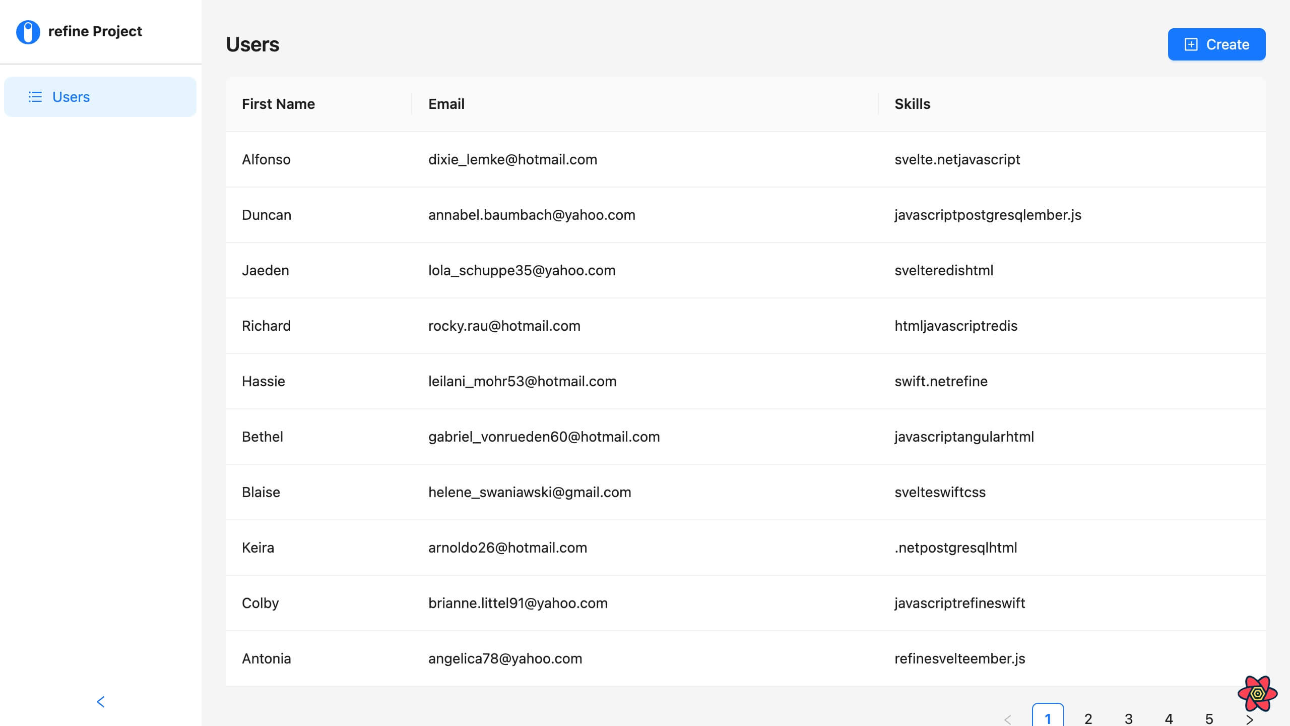
The create button routes us to the Create page when clicked. Right now, it just renders the placeholder text we set earlier. Next, we will set up our dynamic form inside the UserCreate page.
Creating a form
Ant design also provides a form component that ships with various functionalities such as data collection, styling, and data scope management out of the box. The component streamlines the process of quickly building a form in React.
To create the form, first, navigate to the UserCreate.tsx file and import the Create, Form, Button, Input, Icons, Space, and useForm components and hook from @refinedev/antd and antd:
import React from "react";
import { useForm, Create } from "@refinedev/antd";
import { DeleteOutlined, PlusOutlined } from "@ant-design/icons";
import { Button, Form, Input, Space } from "antd";
These are all the UI components and hooks we'll use for the entirety of the UserCreate page setup.
Next, add the following code to the component to render the form:
import React from "react";
import { useForm, Create } from "@refinedev/antd";
import { DeleteOutlined, PlusOutlined } from "@ant-design/icons";
import { Button, Form, Input, Space } from "antd";

interface IFormValue {
  name: string;
  email: string;
  skills: string;
}

export default function UserCreate() {
  const { formProps, saveButtonProps } = useForm<IFormValue>();

  return (
    <Create saveButtonProps={saveButtonProps}>
      <Form {...formProps}>
        <Input placeholder="e.g John" />
        <Input placeholder="e.g john@email.com" />
      </Form>
    </Create>
  );
}
useForm is a Refine hook for handling form data. It offers adapters that let Refine integrate with Ant design's <Form> component.
In the code above, we destructured the formProps and saveButtonProps properties from the useForm hook, then we passed them to the <Create> and <Form> components, respectively.
The formProps property contains all the necessary properties for the form to handle the POST request for its data automatically.
The saveButtonProps property handles the submission functionality of the form via the save button.
If you save your progress at this point and go back to the browser, you'll notice that our form still lacks the basic functionalities of a form and looks desolate.
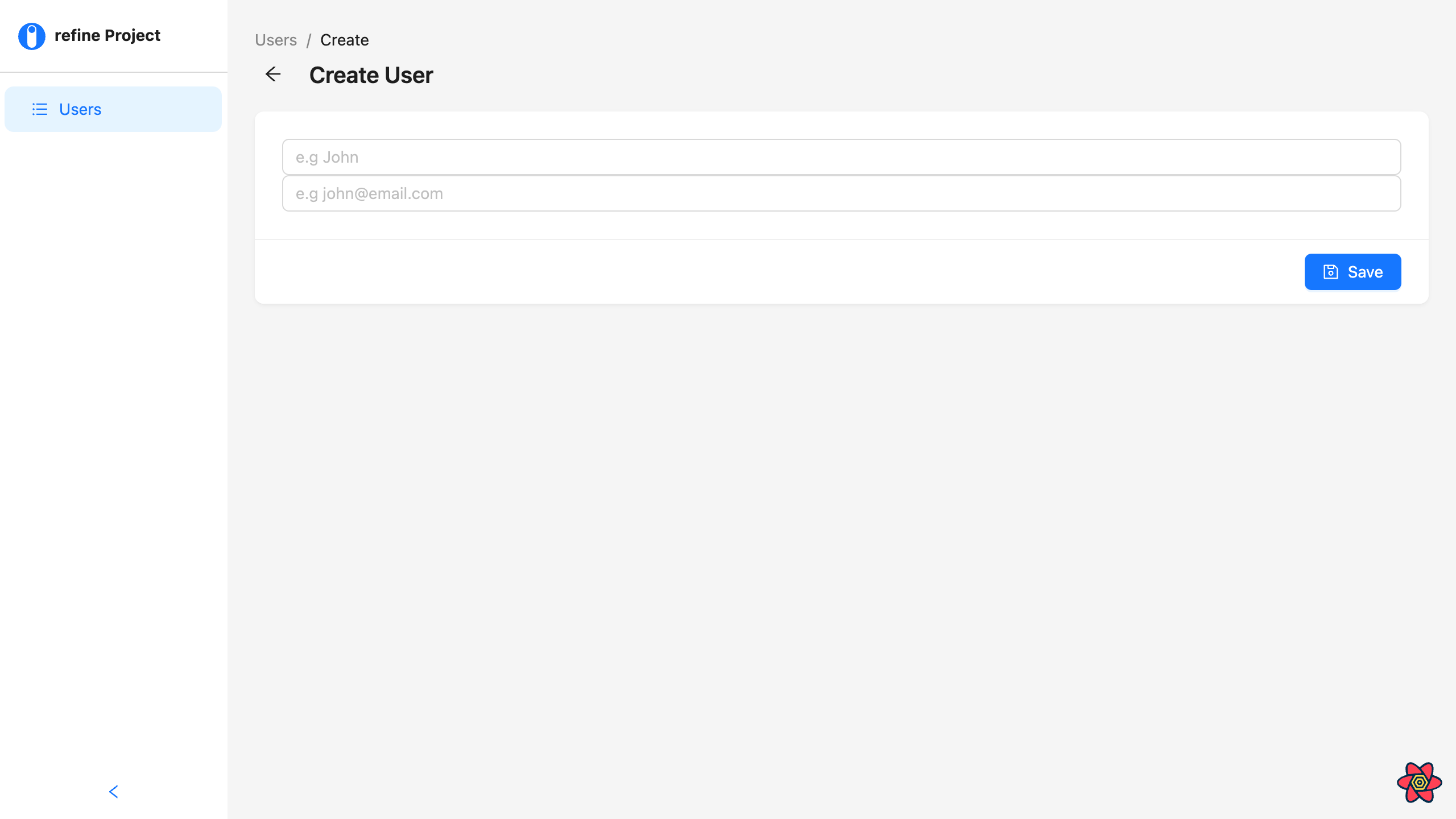
Adding form items
The <Form.Item> component is a sub-component of the <Form> component. It accepts several props for configuring and adding basic or custom validation to input fields.
Here's a list of some of its props:
name: This is for setting a unique name for an input field.label: This prop is for assigning a label to input fieldsrules: This prop is for setting custom validation rules on an input field
Since it is a sub-component of the <Form> component, we don't have to import any other components to use it. All we have to do is wrap it around our form's input fields like so:
<Create saveButtonProps={saveButtonProps}>
  <Form {...formProps} layout="vertical">
    <Form.Item
      name={"firstName"}
      label="First Name"
      style={{ maxWidth: "893px" }}
    >
      <Input placeholder="e.g John" />
    </Form.Item>
    <Form.Item name={"email"} label="Email" style={{ maxWidth: "893px" }}>
      <Input placeholder="e.g developer" />
    </Form.Item>
  </Form>
</Create>
Here, we're using the name and label props to assign each input field a unique name and a label element, respectively.
We also gave the <Form> component a layout prop with a vertical value. This will let the labels display on a block layout rather than the default inline layout.
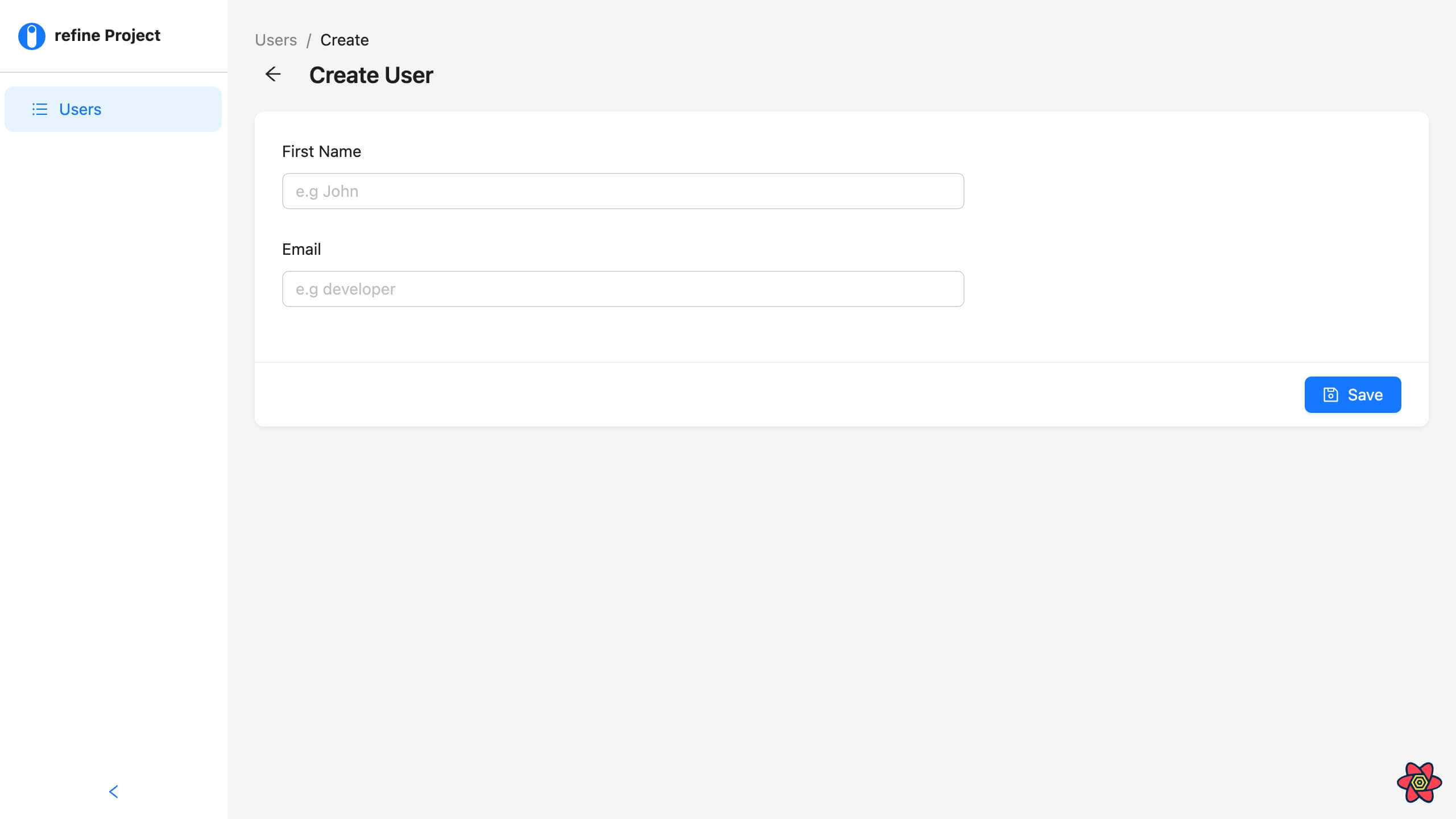
We can also add a basic validation to both fields by passing an array of objects with a required property to the rules prop on the form item component:
<Form.Item
    name={"firstName"}
    label="First Name"
    style={{ maxWidth: "893px" }}
    rules={[{ required: true }]}
>
    <Input placeholder="e.g John" />
</Form.Item>
<Form.Item
    name={"email"}
    label="Email"
    style={{ maxWidth: "893px" }}
    rules={[{ required: true }]}
>
    <Input placeholder="e.g developer" />
</Form.Item>
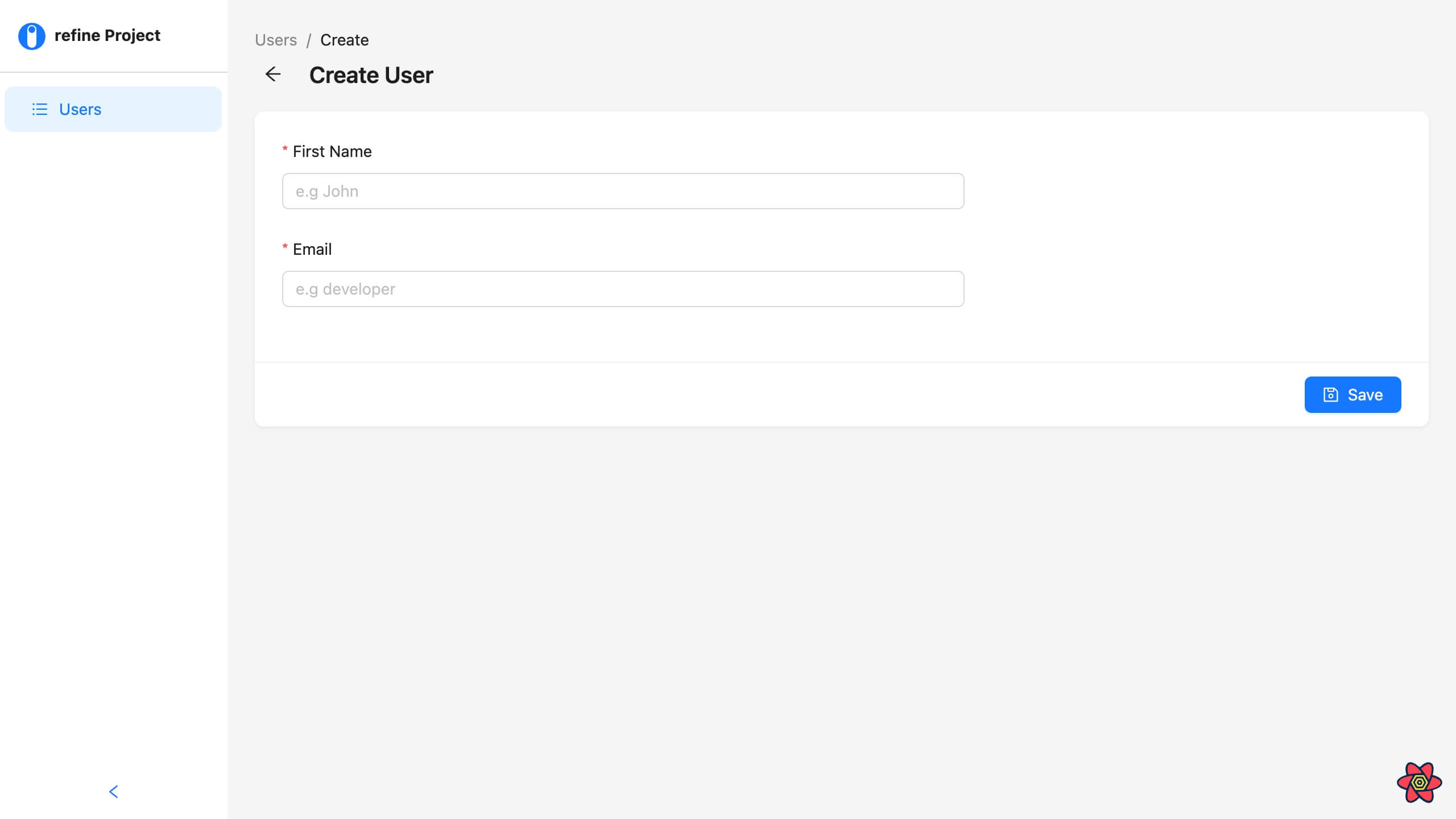
In the subsequent sections, we'll learn how to add a more complex validation to our form. For now, this will do.
Adding form list
Much like the <Form.Item> component, Ant design also provides a <Form.List> sub-component that lets us create dynamic fields that can be added and removed on command.
The component accepts a child function with three parameters:
fields: The fields parameter is used to create a list of dynamic fieldsoperations: The operations parameter is an object with two action functions for adding and removing fields on the list.errors: This parameter does what its name implies - it is used to handle errors for validation.
To add a list to the form, first, declare the <Form.List> component and add the following code within it.
<Form.List name={"skills"}>
  {(fields, operator) => {
    return (
      <>
        {fields.map((field, index) => {
          return (
            <div key={field.key}>
              <Form.Item
                name={field.name}
                label={`skill - ${index + 1}`}
                rules={[{ required: true }]}
              >
                <Input placeholder="e.g javascript" />
              </Form.Item>
            </div>
          );
        })}
        <Form.Item>
          <Button type="dashed" block>
            Add a skill
          </Button>
        </Form.Item>
      </>
    );
  }}
</Form.List>
In the code above, we declared a function and a Add a skill button within the <Form.List> component. We passed the fields and operator parameters to the function, and then we returned an iteration of the fields parameter using a map method. Inside the map callback function, we're returning a <Form.Item> and a nested <Input> component for every dynamic field.
That's all we need for the dynamic fields.
However, if you save your progress and go back to the browser, you won't be able to add the dynamic fields with the Add a skill button just yet.
This is because we're yet to add actions that'll let us add and remove fields on the form. We will be doing this using the operator parameter in the next section.
Using form actions
The operator parameter exposes two function properties, add() and remove() , that let us add and delete dynamic fields in a form. They are relatively straightforward to implement; all we have to do is call them in a button's event handler. In our case, the Add a skill button.
What we can do first is destructure the add() and remove() functions from the operator parameter and add an onClick handler, with the add() function passed in, to the Add a skill button:
<Form.List name={"skills"}>
  {(fields, { add, remove }) => {
    return (
      <>
        {fields.map((field, index) => {
          return (
            <div key={field.key}>
              <Form.Item
                name={field.name}
                label={`skill - ${index + 1}`}
                style={{ width: "400px" }}
                rules={[{ required: true }]}
              >
                <Input placeholder="e.g javascript" />
              </Form.Item>
            </div>
          );
        })}
        <Form.Item>
          <Button
            type="dashed"
            block
            onClick={() => add()}
            style={{ maxWidth: "893px" }}
          >
            Add a skill
          </Button>
        </Form.Item>
      </>
    );
  }}
</Form.List>
Now, the Add a skill button is functional. If you save your progress and test it out, you should be able to add dynamic fields to the form.
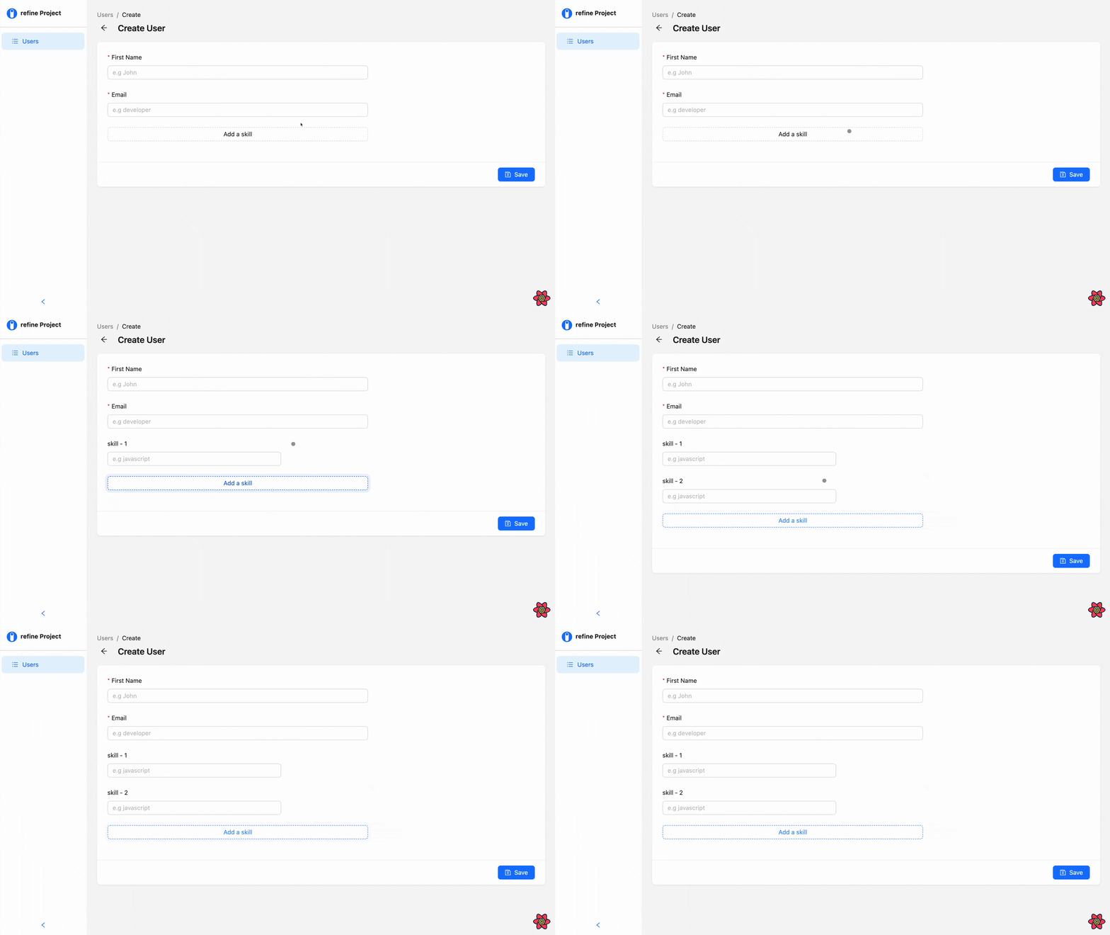
Next, we'll create a button for deleting unwanted fields using the remove() action.
To do so, create a button below the <Form.Item> component inside the map callback function, then add an onClick handler with the remove() function, just as we did for the add() function in the previous example:
import React from "react";
import { useForm, Create } from "@refinedev/antd";
import { DeleteOutlined, PlusOutlined } from "@ant-design/icons";
import { Button, Form, Input, Space } from "antd";

interface IFormValue {
  name: string;
  email: string;
  skills: string;
}

export default function UserCreate() {
  const { formProps, saveButtonProps } = useForm<IFormValue>();

  return (
    <Create saveButtonProps={saveButtonProps}>
      <Form {...formProps} layout="vertical">
        <Form.Item
          name={"firstName"}
          label="First Name"
          style={{ maxWidth: "893px" }}
          rules={[{ required: true }]}
        >
          <Input placeholder="e.g John" />
        </Form.Item>
        <Form.Item
          name={"email"}
          label="Email"
          style={{ maxWidth: "893px" }}
          rules={[{ required: true }]}
        >
          <Input placeholder="e.g john@email.com" />
        </Form.Item>
        <Form.List name={"skills"}>
          {(fields, { add, remove }) => {
            return (
              <>
                {fields.map((field, index) => {
                  return (
                    <Space
                      key={field.key}
                      direction="horizontal"
                      style={{
                        position: "relative",
                        marginRight: "13px",
                      }}
                    >
                      <Form.Item
                        name={field.name}
                        label={`skill - ${index + 1}`}
                        style={{ width: "400px" }}
                        rules={[{ required: true }]}
                      >
                        <Input placeholder="e.g javascript" />
                      </Form.Item>
                      <Button
                        danger
                        onClick={() => remove(field.name)}
                        style={{ marginTop: "5px" }}
                        icon={<DeleteOutlined />}
                      />
                    </Space>
                  );
                })}
                <Form.Item>
                  <Button
                    type="dashed"
                    block
                    style={{ maxWidth: "893px" }}
                    icon={<PlusOutlined />}
                    onClick={() => add()}
                  >
                    Add a skill
                  </Button>
                </Form.Item>
              </>
            );
          }}
        </Form.List>
      </Form>
    </Create>
  );
}
Unlike the former, we're passing the field name as an argument to the remove() function. Since each name is unique to its respective component, the function will only delete the field whose button is clicked.
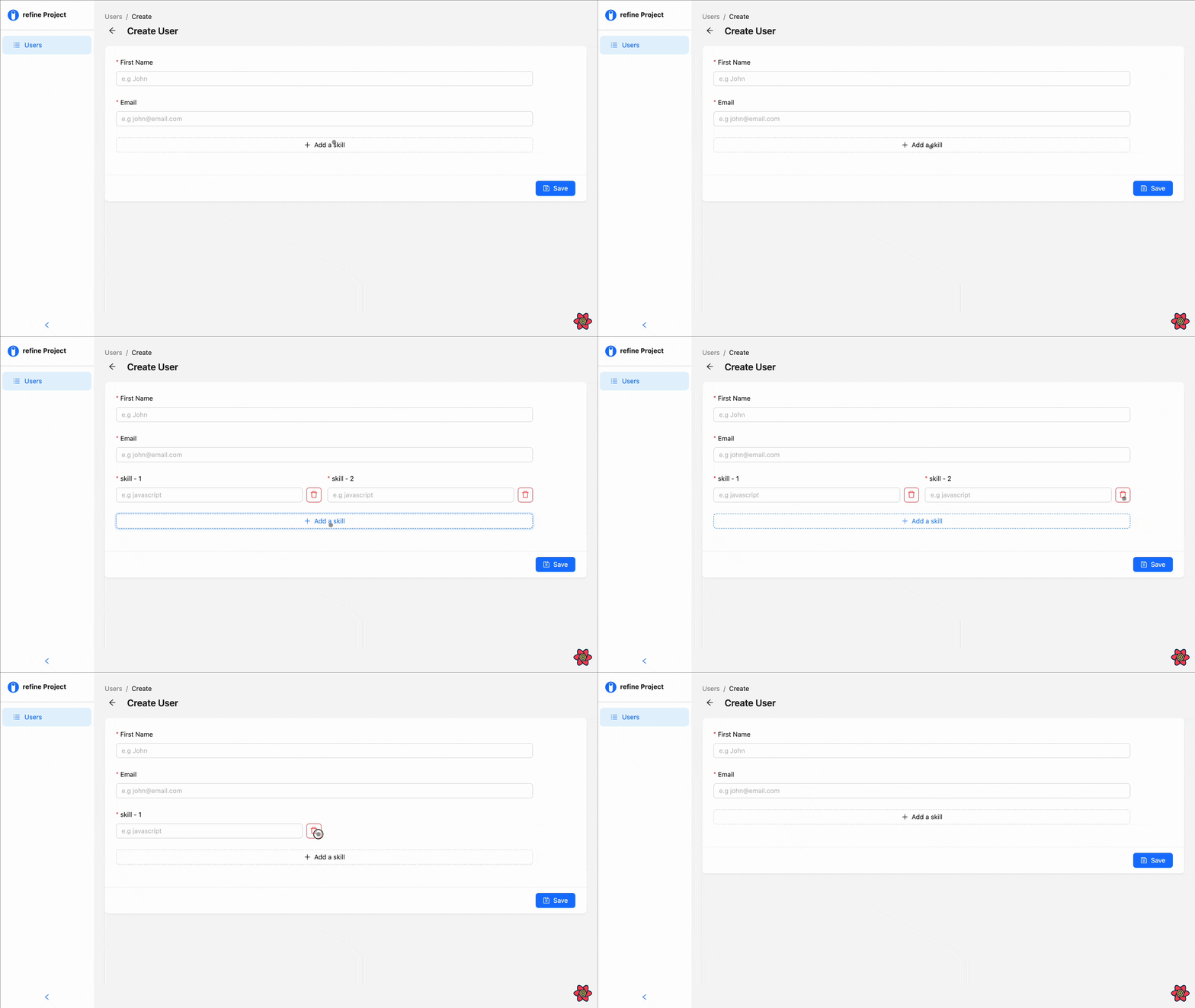
As you can see, our form is not aesthetically appealing. Next, we'll look at how we can replace the delete button with an icon and place it alongside the input box.
Adding icons
Ant design is a full-fledged UI library, providing a collection of free icons that we can use to build interactive user interfaces.
Unlike most design libraries, Ant design provides its icons separately from the base package. so to use it, we'll have to install it separately.
Fortunately for us, Refine comes bundled with both the base package and the icon package of Ant design, so we don't have to waste any more time installing the package.
All we have to do is append an icon name to the <Icons> component we imported earlier and pass it to the icon prop on the delete <Button> component like so:
<div key={field.key}>
  <Form.Item
    name={field.name}
    label={`skill - ${index + 1}`}
    style={{ width: "400px" }}
    rules={[{ required: true }]}
  >
    <Input placeholder="e.g javascript" />
  </Form.Item>
  <Button
    danger
    onClick={() => remove(field.name)}
    style={{ marginTop: "5px" }}
    icon={<DeleteOutlined />}
  />
</div>
You can find the list of icon names on Ant design's official documentation.
To place the icon on the same line with the Input field, replace the div wrapping the <Form.Item> with a <Space> component and give it a direction prop with a horizontal value.
<Space
  key={field.key}
  direction="horizontal"
  style={{
    position: "relative",
    marginRight: "13px",
  }}
>
  <Form.Item
    name={field.name}
    label={`skill - ${index + 1}`}
    style={{ width: "400px" }}
    rules={[{ required: true }]}
  >
    <Input placeholder="e.g javascript" />
  </Form.Item>
  <Button
    danger
    onClick={() => remove(field.name)}
    style={{ marginTop: "5px" }}
    icon={<DeleteOutlined />}
  />
</Space>
Using the same process, we can also add icons to the Add a skill button.
<Button
  type="dashed"
  block
  style={{ maxWidth: "893px" }}
  icon={<PlusOutlined />}
  onClick={() => add()}
>
  Add a skill
</Button>
That's it! We've successfully built a dynamic form that lets users add and delete fields on demand.
To finish up, we'll add custom validation to our fields and look at how we can handle submission on our form.
Validation
We've seen how Ant handles basic validation on input fields using the Form. item's rule prop. In this section, we'll use the property to add custom validations to the fields in our form.
The rule prop accepts an array of config objects that returns a promise. Each object accepts a property that specifies how the fields should validate its data, and a message property, that accepts a string of messages to be displayed when there's an error.
Some of these properties include;
required: This property is for initializing validation on an input field.min: This property is for setting the minimum characters allowed on a field.max: This is for setting the maximum characters allowed on a field.whitespace: This property is for preventing whitespace on a field. It is mostly used on a password input field.message: This property is for displaying error messages.
We added the required property to the rule props in the previous sections. Now, we'll add other properties accompanied by the message property for displaying personalized error messages.
Show UserCreate.tsx code
import React from "react";
import { useForm, Create } from "@refinedev/antd";
import { DeleteOutlined, PlusOutlined } from "@ant-design/icons";
import { Button, Form, Input, Space } from "antd";

interface IFormValue {
  name: string;
  email: string;
  skills: string;
}

export default function UserCreate() {
  const { formProps, saveButtonProps } = useForm<IFormValue>();

  return (
    <Create saveButtonProps={saveButtonProps}>
      <Form {...formProps} layout="vertical">
        <Form.Item
          name={"firstName"}
          label="First Name"
          style={{ maxWidth: "893px" }}
          rules={[
            { required: true, message: "please enter your name" },
            {
              whitespace: true,
            },
            {
              min: 3,
              message: "field must be at least 3 characters",
            },
          ]}
          hasFeedback
        >
          <Input placeholder="e.g John" />
        </Form.Item>
        <Form.Item
          name={"email"}
          label="Email"
          style={{ maxWidth: "893px" }}
          rules={[
            { required: true, message: "please enter your email" },
            { whitespace: true },
            {
              min: 3,
              message: "field must be at least 3 characters",
            },
          ]}
          hasFeedback
        >
          <Input placeholder="e.g john@email.com" />
        </Form.Item>
        <Form.List name={"skills"}>
          {(fields, { add, remove }) => {
            return (
              <>
                {fields.map((field, index) => {
                  return (
                    <Space
                      key={field.key}
                      direction="horizontal"
                      style={{
                        position: "relative",
                        marginRight: "13px",
                      }}
                    >
                      <Form.Item
                        name={field.name}
                        label={`skill - ${index + 1}`}
                        style={{ width: "400px" }}
                        rules={[
                          {
                            required: true,
                            message: "please enter your skill",
                          },
                          { whitespace: true },
                          {
                            min: 3,
                            message: "field must be at least 3 characters",
                          },
                        ]}
                        hasFeedback
                      >
                        <Input placeholder="e.g javascript" />
                      </Form.Item>
                      <Button
                        danger
                        onClick={() => remove(field.name)}
                        style={{ marginTop: "5px" }}
                        icon={<DeleteOutlined />}
                      />
                    </Space>
                  );
                })}
                <Form.Item>
                  <Button
                    type="dashed"
                    block
                    style={{ maxWidth: "893px" }}
                    icon={<PlusOutlined />}
                    onClick={() => add()}
                  >
                    Add a skill
                  </Button>
                </Form.Item>
              </>
            );
          }}
        </Form.List>
      </Form>
    </Create>
  );
}
To spice things up, we can add feedback icons that display according to the state of the input fields: a red crossed circle when there's an error and a green checkmark when there's none.
All we need to do is add a hasFeedback prop to each <Form.Item> like so:
<Form.Item
  name={"firstName"}
  label="First Name"
  style={{ maxWidth: "893px" }}
  rules={[
    { required: true, message: "please enter your name" },
    {
      whitespace: true,
    },
    {
      min: 3,
      message: "field must be at least 3 characters",
    },
  ]}
  hasFeedback
>
  <Input placeholder="e.g John" />
</Form.Item>
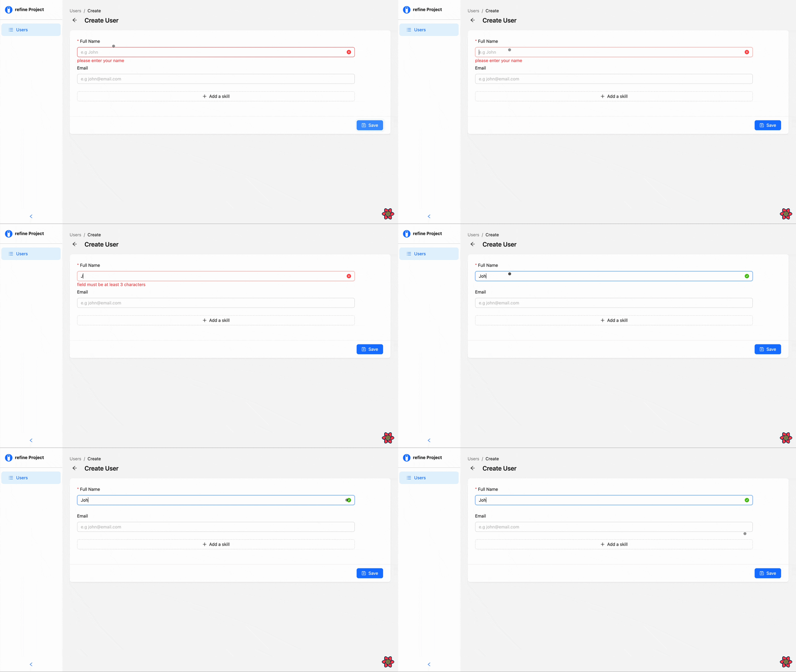
There you have it, an adequately validated dynamic form without the help of an external schema library.
Now, our form is ready to validate input values and perform POST requests to our fake API endpoint.
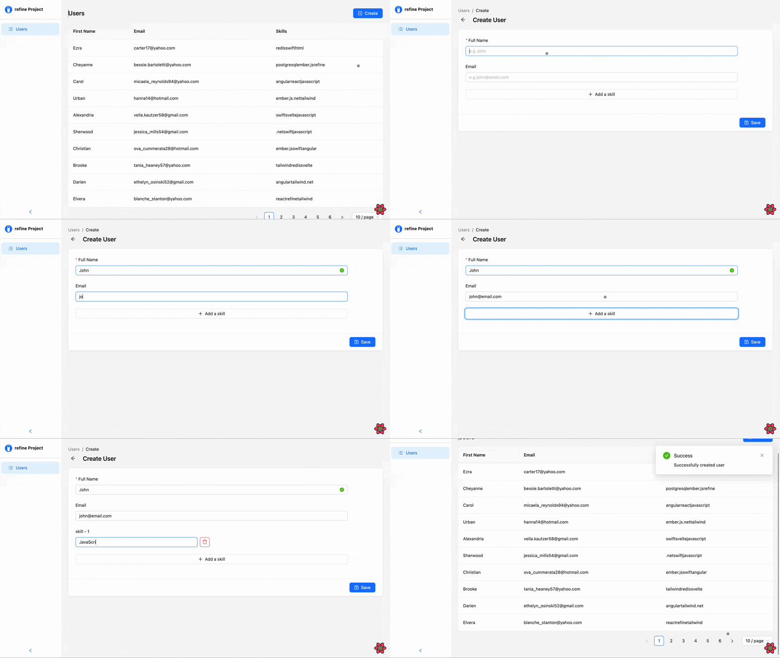
What's left for us now is setting up the edit page to update fetched records from the API.
Building the edit page
As you might have noticed earlier, Refine didn't automatically add an edit button to the table on the List page. So before we set up the edit page, we must first add an edit button that will route users to the edit page when clicked.
To do this, go back to the <UserList> file, import the <EditButton> component, and add a new <Table.Column> component with the following props:
import React from "react";
import { EditButton, List, useTable } from "@refinedev/antd";
import { Space, Table } from "antd";

interface IFormValue {
  name: string;
  email: string;
  skills: string;
  id: number;
}

export default function UserList() {
  const { tableProps } = useTable<IFormValue>();
  return (
    <List>
      <Table {...tableProps} rowKey="id">
        <Table.Column dataIndex="firstName" title="First Name" />
        <Table.Column dataIndex="email" title="Email" />
        <Table.Column dataIndex="skills" title="Skills" />
        <Table.Column<IFormValue>
          title="Actions"
          dataIndex="actions"
          render={(__text_, _record_): React.ReactNode => {
            return (
              <Space>
                <EditButton size="small" recordItemId={_record_.id} hideText />
              </Space>
            );
          }}
        />
      </Table>
    </List>
  );
}
The <EditButton> component uses Ant's Button component and Refine's useNavigation hook under the hood. It displays an edit icon with the functionality of redirecting users to the edit page of a record, whose id is passed to the recordItemId prop of the component, when clicked on.
Refer to the <EditButton> documentation to learn more about the component.
In the example above, we're using the render prop to choose the appropriate record on the table, and passing its id to the recordItemId prop on the <EditButton> component. This way, the button will only redirect us to the edit page of the record being clicked on.
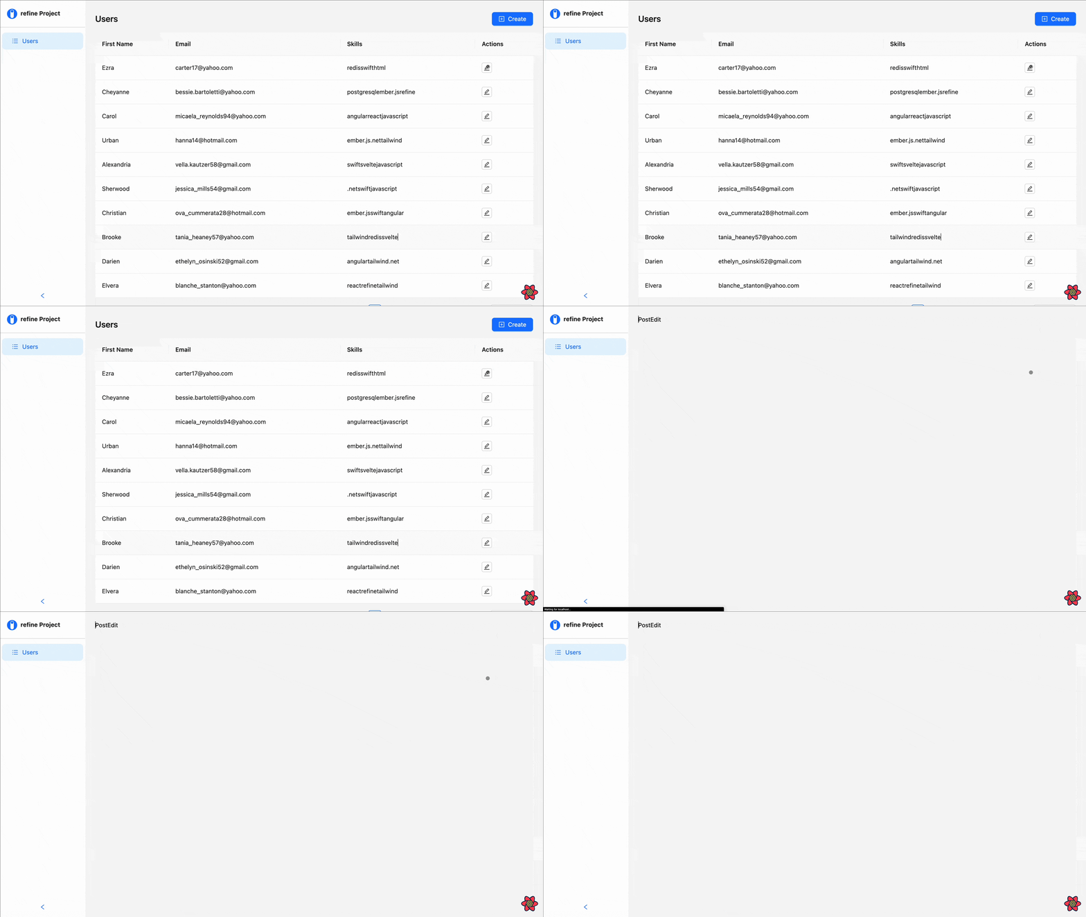
Next, navigate back to the UserEdit file and replace the placeholder with the following code:
Show UserEdit code
import React from "react";
import { useForm, Edit } from "@refinedev/antd";

import { DeleteOutlined, PlusOutlined } from "@ant-design/icons";
import { Form, Input, Button, Space } from "antd";

interface IFormValue {
  name: string;
  email: string;
  skills: string;
}

export default function UserEdit() {
  const { formProps, saveButtonProps } = useForm<IFormValue>();
  return (
    <Edit saveButtonProps={saveButtonProps}>
      <Form {...formProps} size="large" layout="vertical">
        <Form.Item
          name={"firstName"}
          label="First Name"
          style={{ maxWidth: "600px" }}
          rules={[
            {
              required: true,
              message: "please enter your first name",
            },
            {
              whitespace: true,
            },
            {
              min: 3,
              message: "field must be at least 3 characters",
            },
          ]}
          hasFeedback
        >
          <Input placeholder="e.g John" />
        </Form.Item>
        <Form.Item
          name={"email"}
          label="Email"
          style={{ maxWidth: "600px" }}
          rules={[
            {
              required: true,
              message: "please enter your email: e.g john@email.com",
            },
            {
              whitespace: true,
            },
            {
              min: 3,
              message: "field must be at least 3 characters",
            },
          ]}
          hasFeedback
        >
          <Input placeholder="e.g john@email.com" />
        </Form.Item>
        <Form.List name={"skills"}>
          {(fields, { add, remove }) => {
            return (
              <>
                {fields.map((field, index) => {
                  return (
                    <Space
                      key={field.key}
                      direction="horizontal"
                      style={{
                        display: "flex",
                        position: "relative",
                      }}
                    >
                      <Form.Item
                        name={field.name}
                        label={`skill - ${index + 1}`}
                        style={{ width: "400px" }}
                        rules={[
                          {
                            required: true,
                            message: "please enter a skill",
                          },
                          {
                            whitespace: true,
                          },
                          {
                            min: 3,
                            message: "field must be at least 3 characters",
                          },
                        ]}
                        hasFeedback
                      >
                        <Input placeholder="e.g javascript" />
                      </Form.Item>
                      <Button
                        danger
                        onClick={() => remove(field.name)}
                        style={{
                          position: "absolute",
                          top: "47px",
                        }}
                        icon={<DeleteOutlined />}
                      ></Button>
                    </Space>
                  );
                })}
                <Form.Item>
                  <Button
                    icon={<PlusOutlined />}
                    type="dashed"
                    block
                    style={{ maxWidth: "600px" }}
                    onClick={() => add()}
                  >
                    Add a skill
                  </Button>
                </Form.Item>
              </>
            );
          }}
        </Form.List>
      </Form>
    </Edit>
  );
}
This is a duplicate of the form component we created inside the UserCreate page earlier, with the exception of the <Edit> component we're using to wrap the form instead of the former - <Create> component.
<Edit> is a Refine component for wrapping form components that are meant for editing and updating data responses. The <Edit> component provides actions such as save, delete, and refresh buttons that can be used in a form.
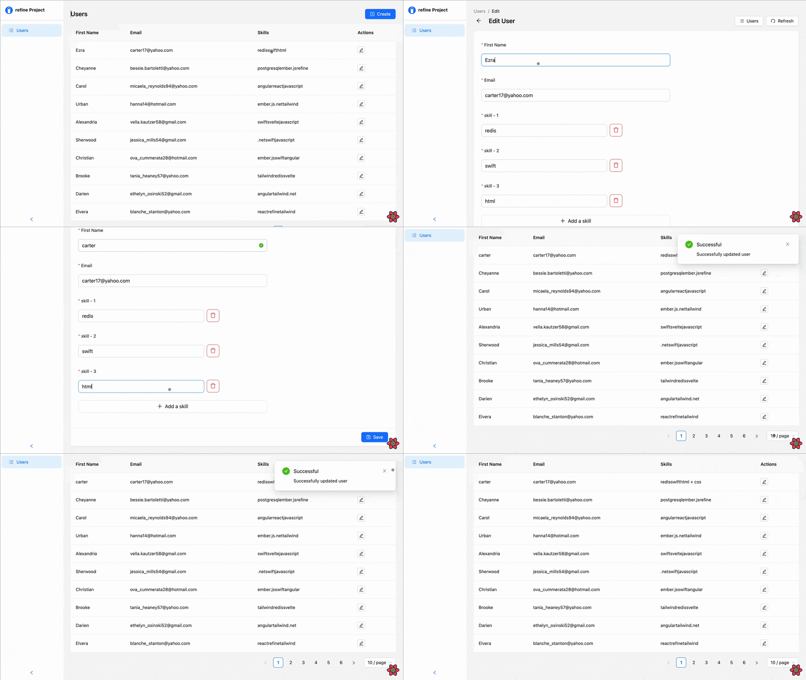
That's it. We've successfully built an application that uses an API to post and edit response records using a dynamic form.
As a challenge, visit Refine's documentation to learn how you can add a delete button to the fields on the table and make your application a full-fledged CRUD application.
FAQ's
What is a dynamic form? A dynamic form is one that automatically changes its structure depending on what the user enters, often allowing users to add or remove fields dynamically.
How do I start using dynamic fields from Ant Design? To manage dynamic fields, use the component and methods provided by
<Form.List>: add() and remove().Is it possible to add validation to dynamic form fields? Yes, you can utilize the rules prop on
<Form.Item>to extend your own validate logic.
Why Use AntD Dynamic Forms?
Dynamic forms improve user satisfaction by:
- Simplifying User Input: Users only see fields they need, reducing form clutter.
- Flexibility: Provide the user with the facility to add or remove fields as required.
- Streamlining Complex Data: Collect additional details without overwhelming users with lengthy forms upfront. • Saving Time: Automate repetitive input scenarios with less manual work.
Conclusion
In this article, we introduced Refine and looked at how to set up a Refine complete CRUD app project with a third-party UI library - in this case, the Ant design library. Then, we looked at how to create a List , Edit , and Create page for handling CRUD functionalities in our app.
We also looked at creating a dynamic form that renders and deletes fields on demand, validates input values, and handles submission using Ant's Form component and its sub-components.
Example
npm create refine-app@latest -- --example blog-refine-antd-dynamic-form


